ANJU MACE
An identity for women's fitness built on the balance between strength and lightness, technique and sensitivity.
- Client
- ANJU MACE
- Year
- 2025
- Role
- Art direction and design team coordination
- Scope
- Visual identity, symbols, brandbook, applications and digital

Context and challenge
Anju Mace is a fitness coach dedicated to training women, with her own method and a personalized training app for her students.
The challenge was to bring a new perspective to women's fitness, a category that usually speaks through excess: saturated colors, quick promises, an aesthetic of strain. The brand needed to talk about technical precision and lasting results with the calm and sophistication of a conscious luxury brand.
Concept
Every visual choice comes from the balance between strength and lightness. The minimalist aesthetic projects professionalism without ostentation and conveys a functional, timeless beauty: a woman who masters technique without losing sensitivity.
The principle that guides the system: true refinement lies in discipline, precision and the harmony between form and function.

Signature and variations
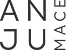
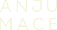
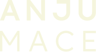
The all-caps signature, with generous spacing and a weight contrast between ANJU and MACE, balances authority and breathing room. The variations (horizontal, vertical and stacked) are not alternative versions but deliberate extensions of the same signature: the horizontal conveys stability and confidence; the vertical, lightness and sophistication.






Color
Natural neutrals — cream, olive and sage — form the base and convey calm, clarity and self-care. Graphite black adds weight and grounding; soft yellow brings controlled energy. Nothing is decorative: every color has a role in the brand's language.
-
Graphite Black
- HEX
- #262626
- RGB
- 38 38 38
- CMYK
- 72 65 64 69
-
Olive Green
- HEX
- #7A8569
- RGB
- 122 133 105
- CMYK
- 54 36 62 10
-
Sage Green
- HEX
- #9EAB87
- RGB
- 158 171 135
- CMYK
- 41 23 53 1
-
Neutral Cream
- HEX
- #F5F5DD
- RGB
- 245 245 221
- CMYK
- 3 1 15 0
-
Soft Yellow
- HEX
- #E6E6AD
- RGB
- 230 230 173
- CMYK
- 11 3 39 0
Typography
Lexend, a contemporary sans serif with precise drawing and generous spacing, signs the brand and reflects the discipline found throughout the identity. Outfit is the secondary typeface, with softer strokes, adding versatility without losing the minimalist character.
Lexend
Outfit
Symbols
Five fine-line symbols turn the brand's pillars into form. Together they work as a graphic alphabet for packaging, content and the digital product.
-
Excellence as self-respect
A target: precision, focus, discipline and technical mastery.
-
Real, lasting change
A link between past and future: conscious transformation that lasts.
-
Feminine intelligence
A spring that propels the others: influence, leadership and collective inspiration.
-
Knowledge is freedom
Stepping out of a bubble: breaking patterns and creating your own path.
-
Function and beauty
Orbits in balance: harmony between form and function.

Touchpoints
The system unfolds from apparel to packaging, from social media to the digital product. The vertical signature becomes a print, the symbols become a pattern, and the natural palette keeps everything recognizable even when the logo is absent.


Results
The identity launched together with the training app, which is now live. The client said no one had ever understood her essence so well, and her students connected with the new brand right away.
I led the project as art director, coordinating the design team from visual strategy to final applications.